Harcourts
Helping Harcourts find where they belong
Background
Harcourts had been on the look out for a strategic brand agency to help them bring together all aspects of the brand experience into a centralised idea. Upon appointment, Traffic was brought into explore the vast network which boasts almost 1000 offices across 10 countries, and a team of over 6,600 sales consultants.
It became clear that in order to develop a centralised idea that united their considerable network, Traffic needed to directly engage across all levels of the network through a series of roadshow workshops and one on one interviews – from the executive team, through to the office network – to really get to know what made Harcourts the fastest growing real estate brand in Australasia.
Strategy
Traffic created a series of workshops that were designed to uncover the key insights that separated Harcourts from their competitors and what was at the core of their driving ambition. These were aimed at capturing a true cross section of locations, business owner stakeholders and corporate management.
After many workshops, zoom calls and face to face meetings, and using our Brand Metabolism process, we distilled all the information and insights gathered in the discovery phase into a consolidated brand strategy report.
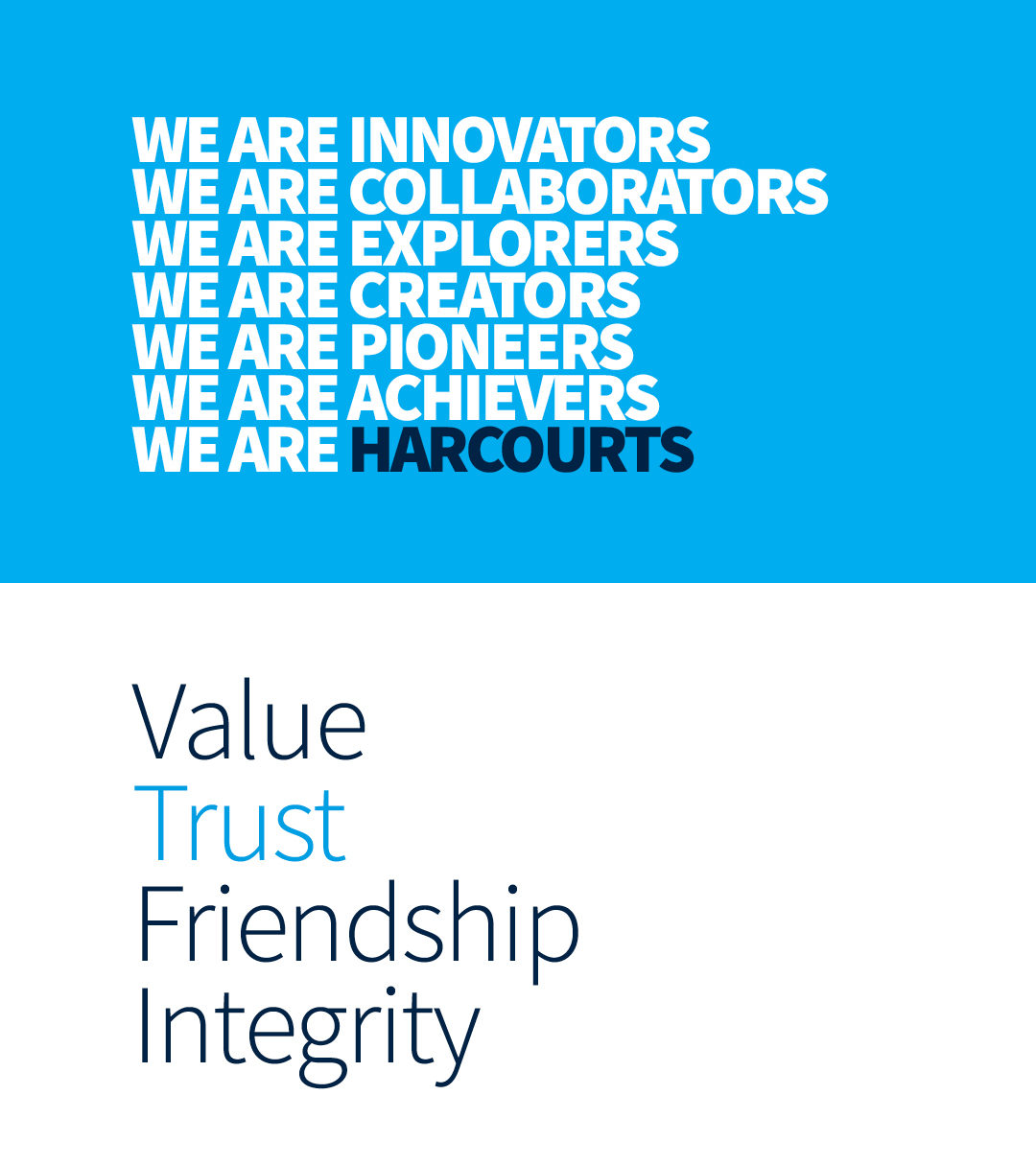
Building the strategic foundation around internal brand values that were already well entrenched in the business, Traffic reconceptualised these foundations to create a centralised idea for the brand, one that was relevant across the whole Harcourts global network of over 10 countries.
Solution
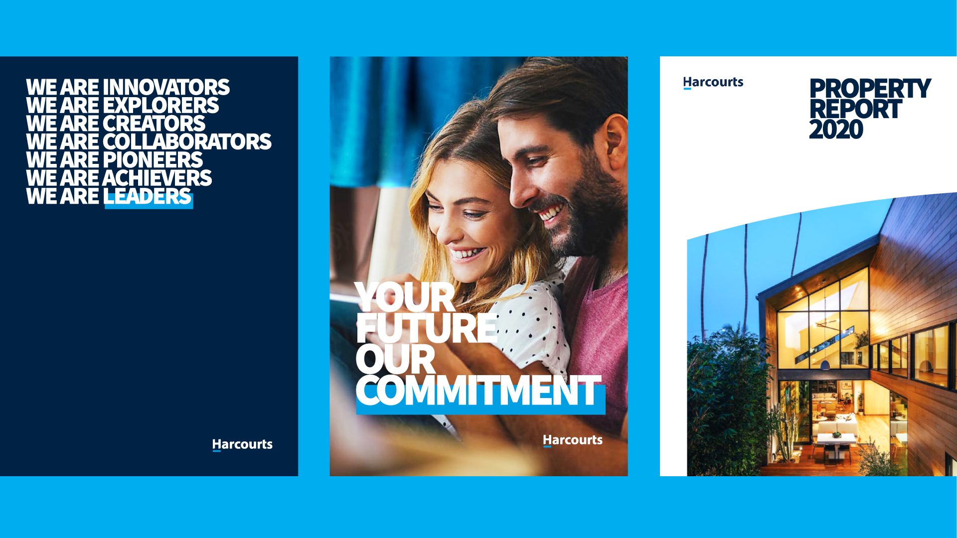
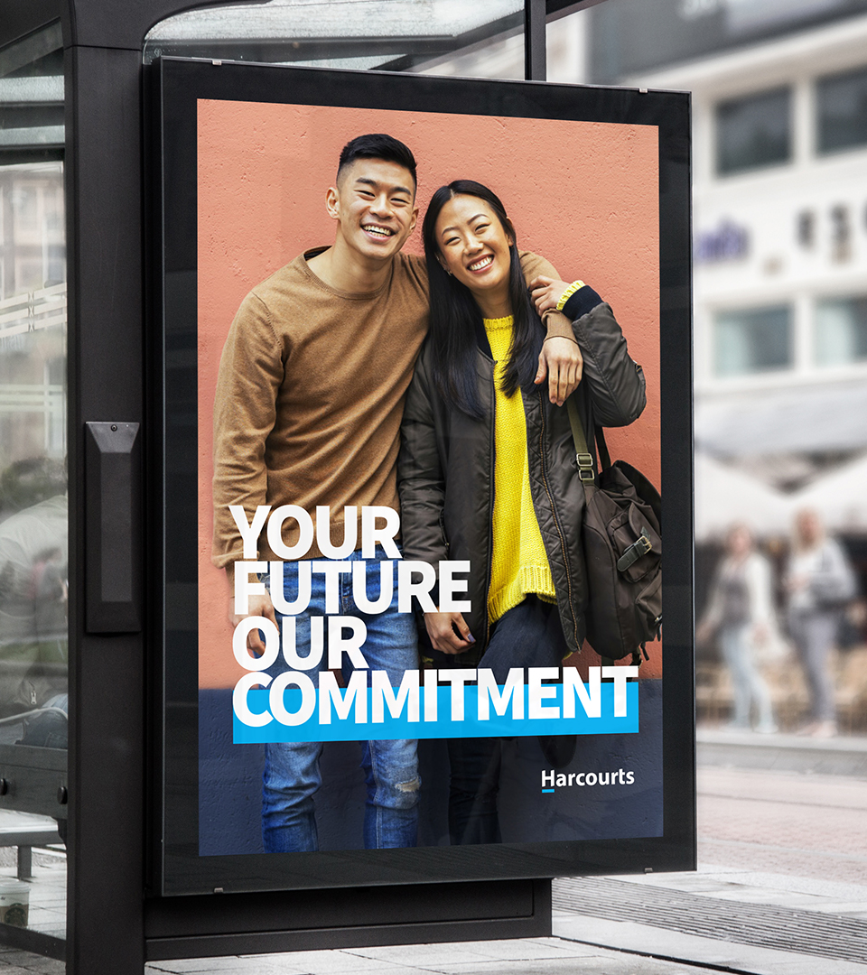
The core thought ‘Find where you belong’ articulates the unshakeable dedication represented at all levels of the Harcourts business to support their clients, team and partners achieve success. It represents their commitment both internally and externally, activating the passion of their team to be their best to support their community and clients reach their goal.
The creative team used this proposition to create a centralised idea that brought the Harcourts personality to life in a consistent look, feel and tone of voice. Our role was to develop a foundation to drive a visual brand persona that was more aligned to the reality of the Harcourts offering, beliefs and behaviours.
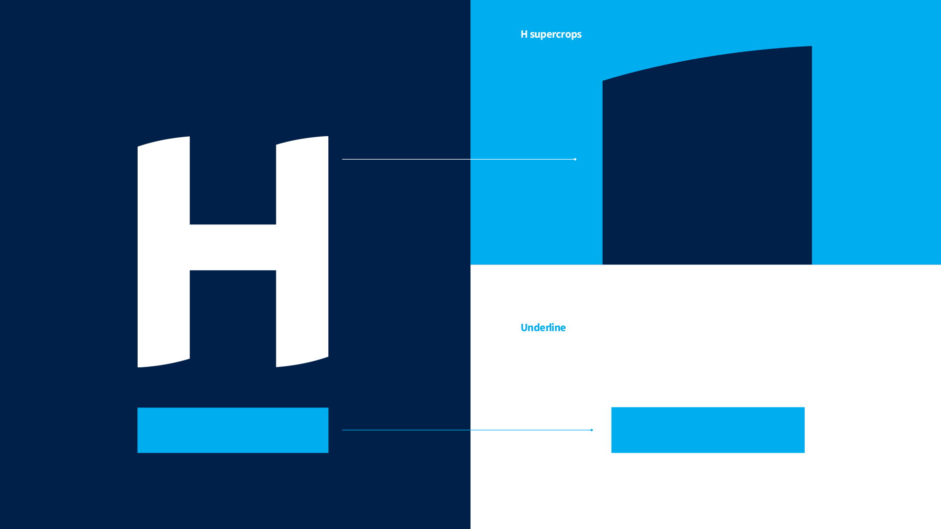
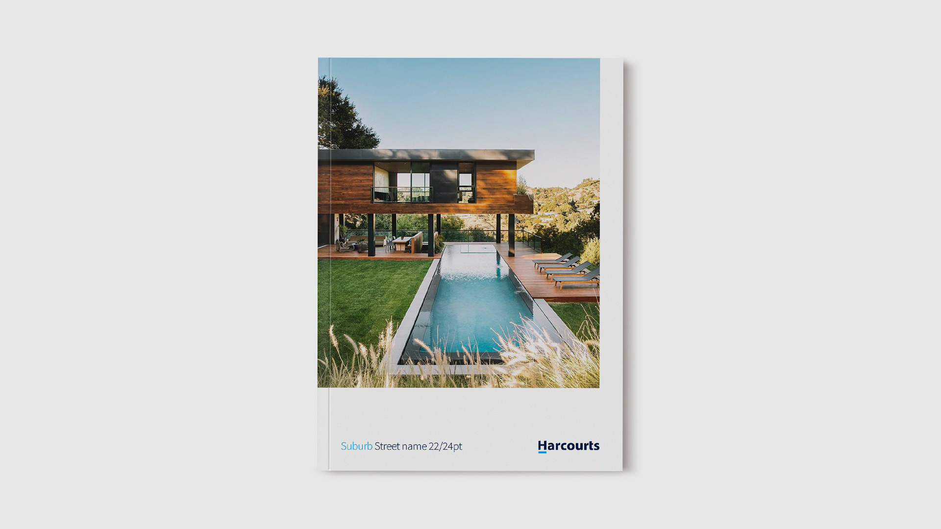
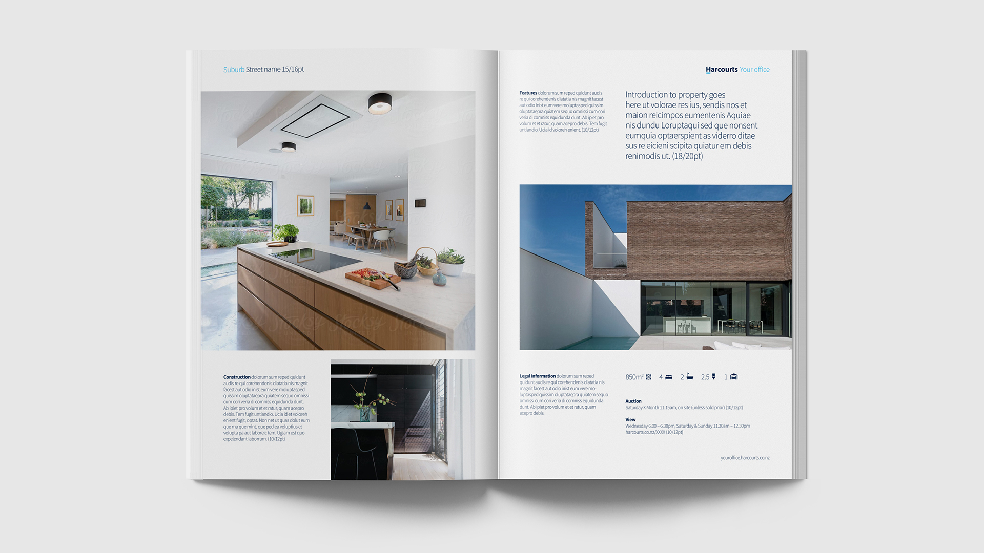
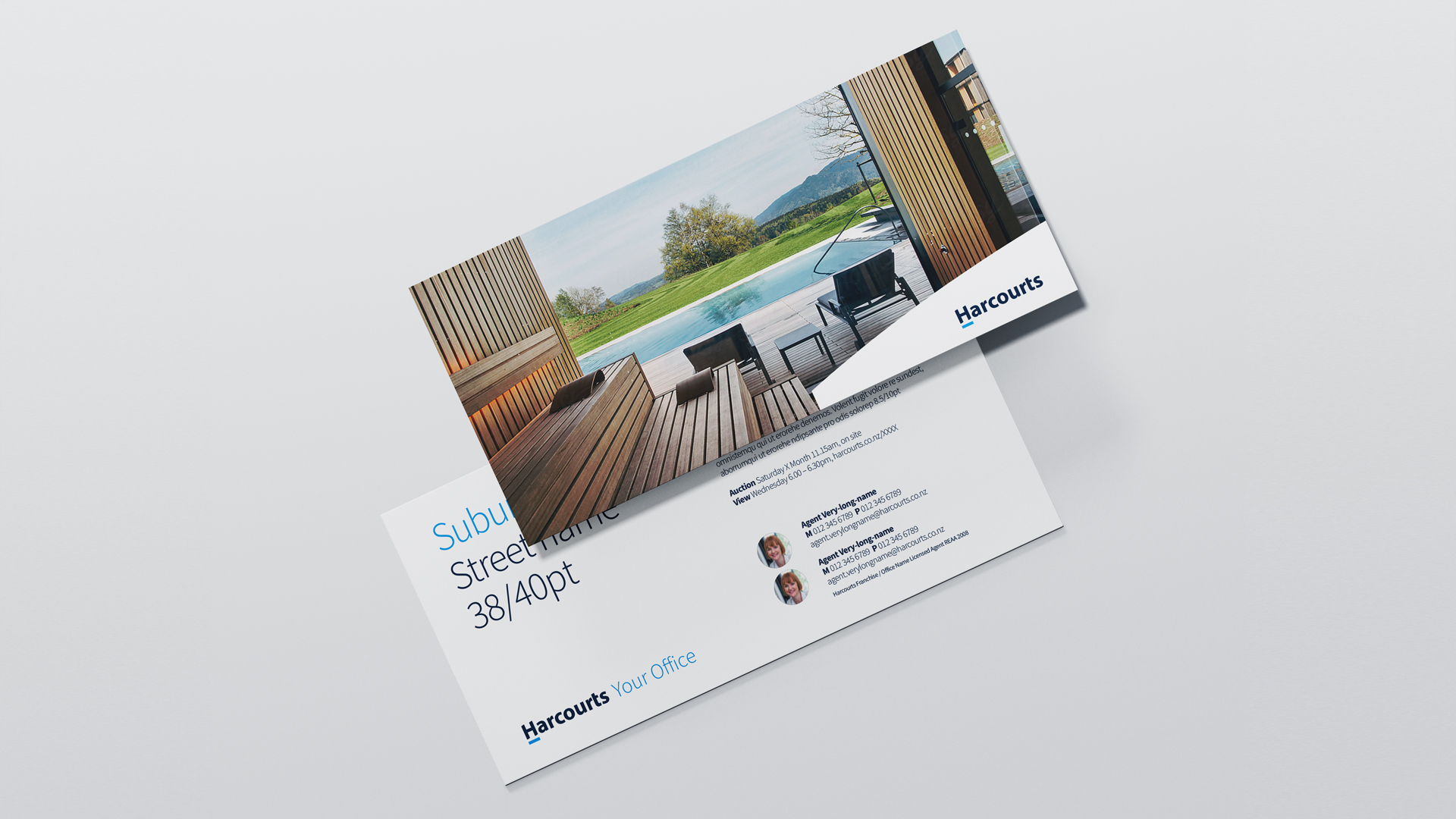
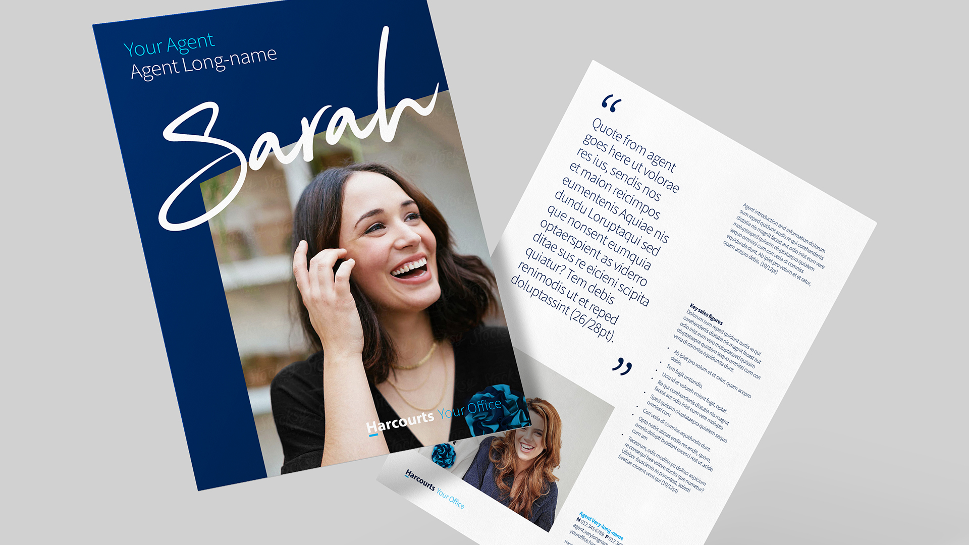
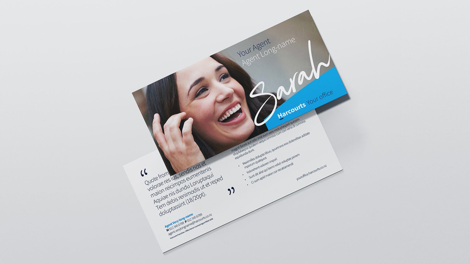
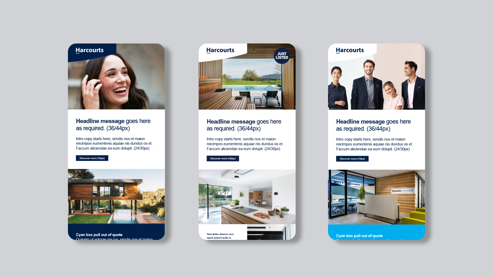
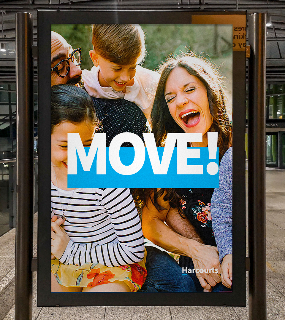
The central tenants of the foundation were typography, colour, photography and graphic language. We developed a graphic language from the logo mark, creating super crops, underlines, windows using the H to form bold, distinctive graphics.
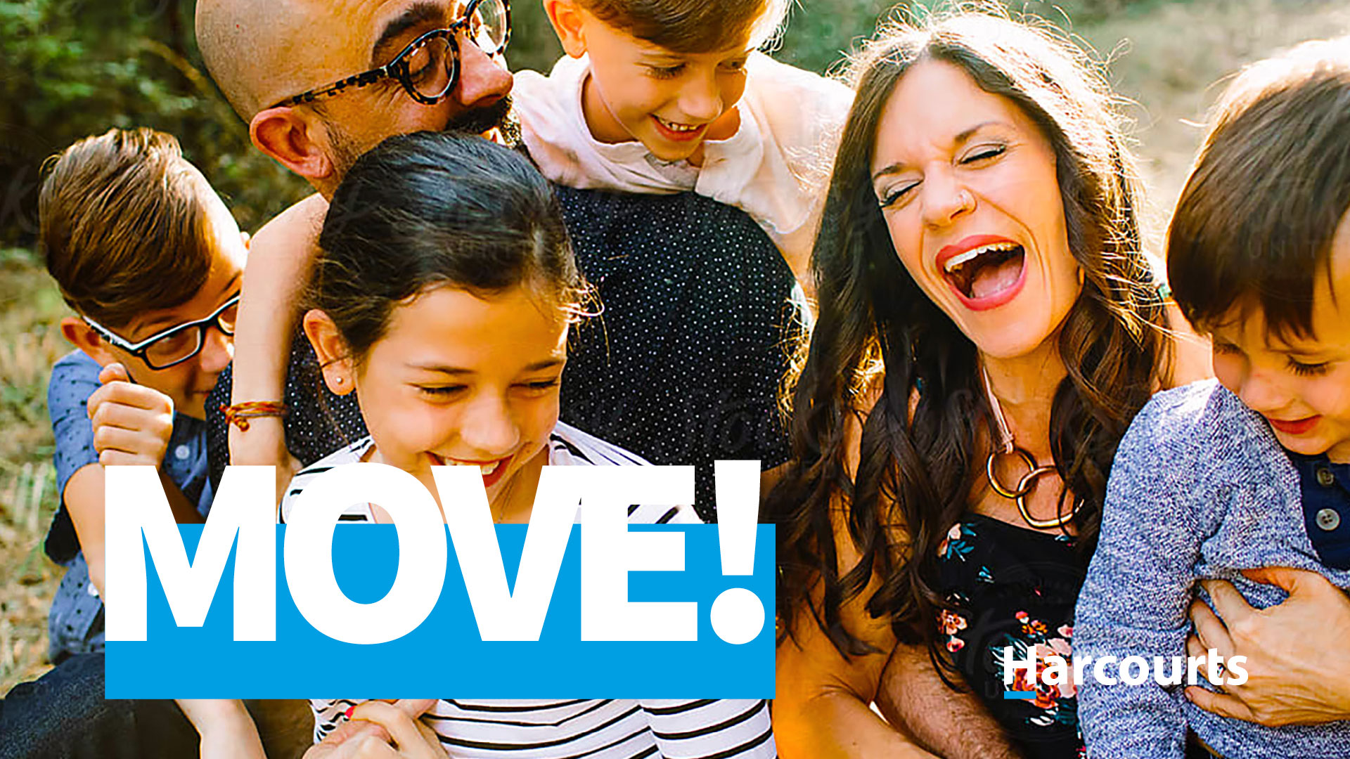
Traffic introduced a bespoke script font that added humanity into the brand. The photographic treatment was to humanise the team in a natural, relaxed not staged style. We introduced vibrancy into the photography through colour, motion, tone and real human connections. Introducing moments of clarity within the property photography style, small details that capture your eye within a home, not always relying on the traditional wide angle lenses.
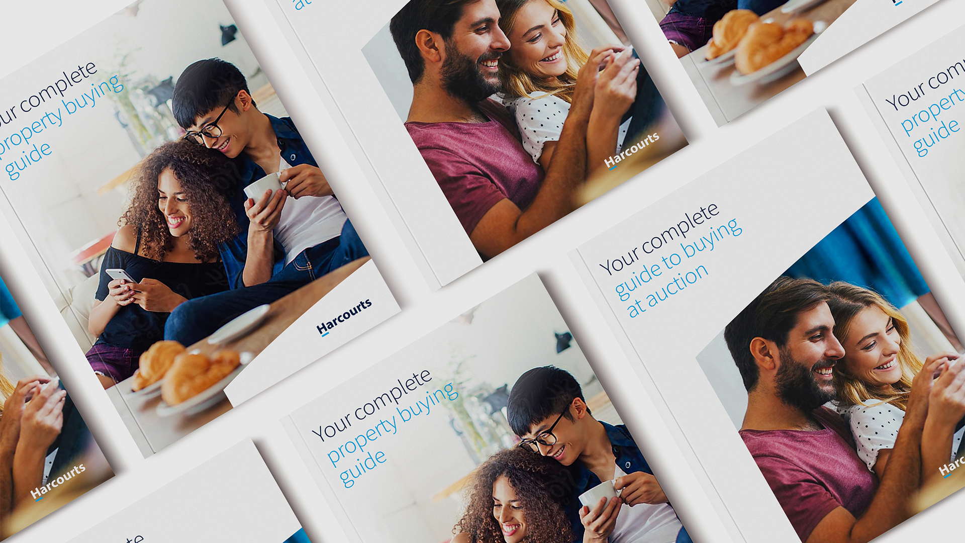
This visual identity was applied across all elements across the network’s extensive marketing requirements (both physical and digital) for brand, property and agent marketing collateral. These elements are currently being rolled out internationally as part of the year long project plan.