Dobsons
Making a Melbourne institution ready for school
Background
Dobsons are a Melbourne institution, a proud family-owned and operated school uniform manufacturer for over 100 years. They’re a pillar of the communities in which they serve, quietly building a reputation for quality design and excellent customer service. Following their 100th birthday and looking towards the future, Dobsons are in the process of executing their plan to meet their aspirations. Dobsons approached Traffic to develop a brand strategy and identity that would set them up for success.
Strategy
Through workshops and staff and customer interviews, it was clear that one of the brand’s biggest strengths was also working against the perception of the brand. The long history and high quality of the product created a feeling that the brand was seen as belonging to the elite private school market, making it inaccessible to the growing public school market. Traffic’s challenge was to find a way in which we could retain and leverage the brand’s heritage and reputation to appeal to a broader market.
Our research led to the understanding that uniforms played a key role in the perception and public image of the school. They also helped to create a strong sense of belonging and pride for students, staff and family. As a typically conservative market, Dobson’s competitors presented themselves as traditional and staid in their visual identity, claiming to position as uniform specialists.
Solution
Armed with the insights and market context following the discovery phase, we knew there was an opportunity to meet the client’s objectives and develop a unique positioning in the market that created a distinctive and unique solution.
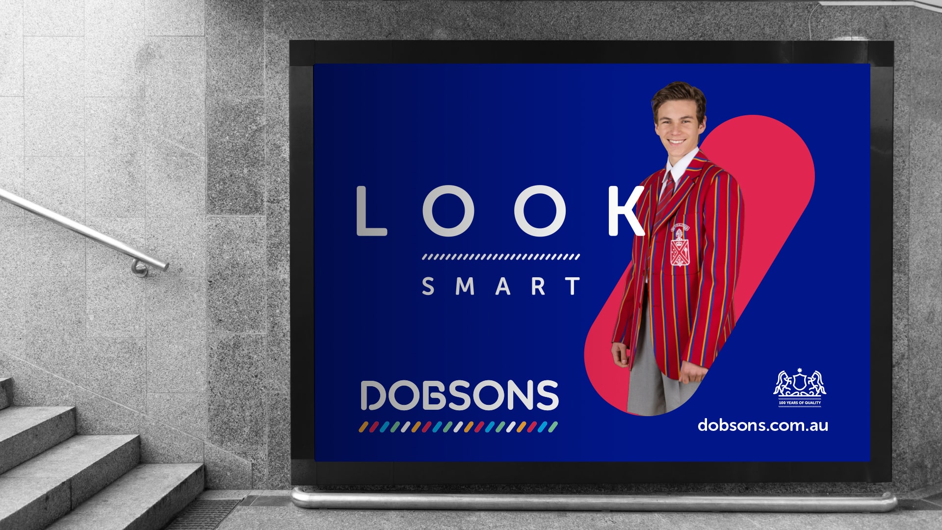
Tapping into the family legacy of being an integral part of the community and their ability to design and manufacture uniforms that captured the spirit of the school and created a sense of belonging for students, so that they could be their best.
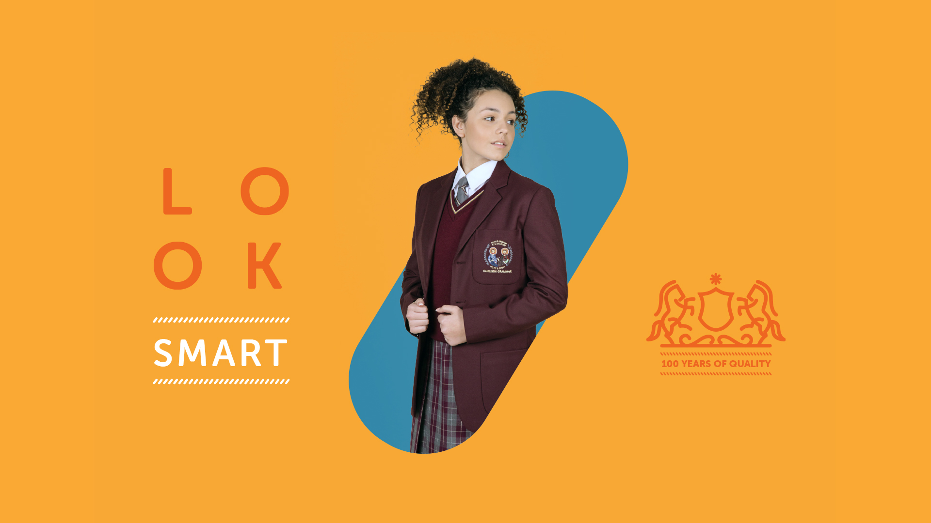
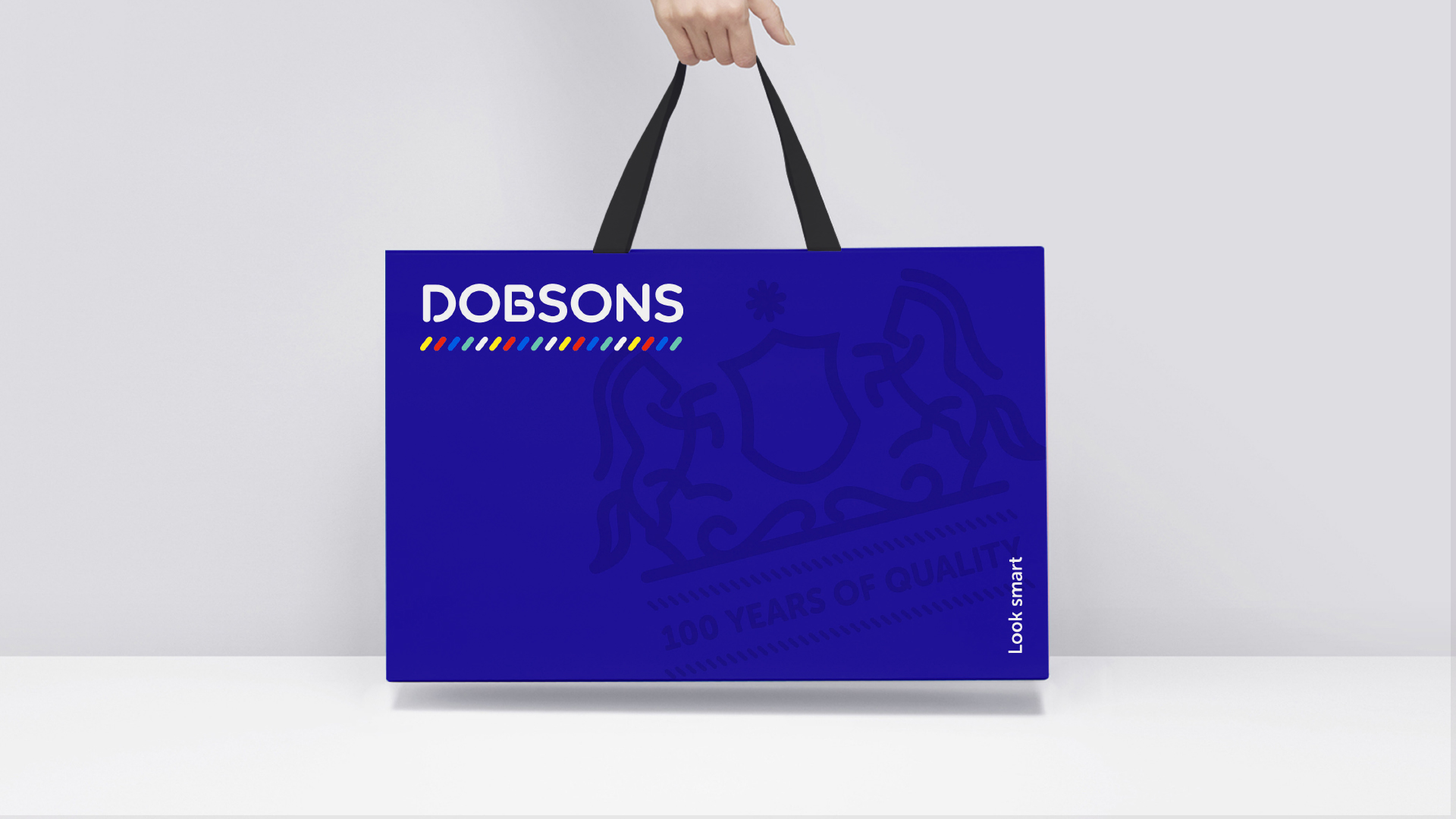
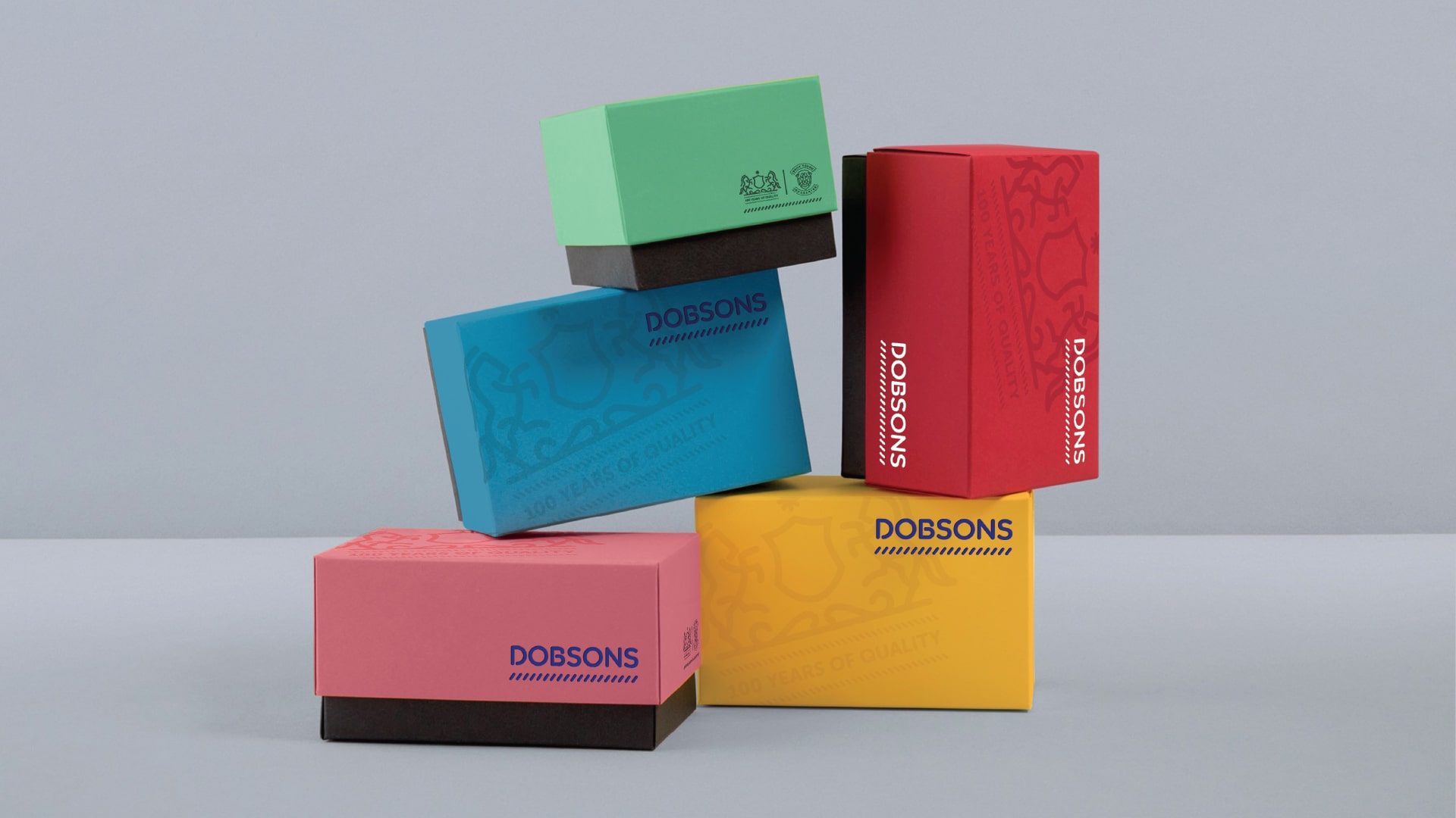
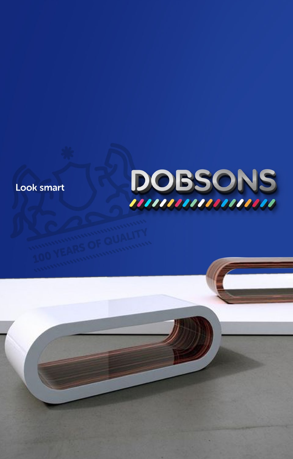
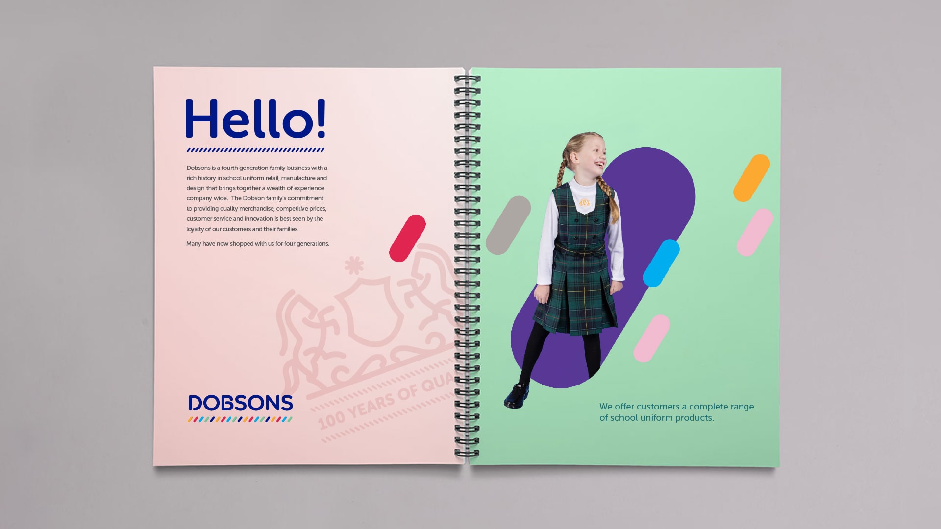
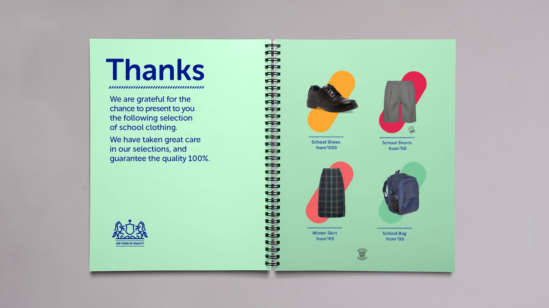
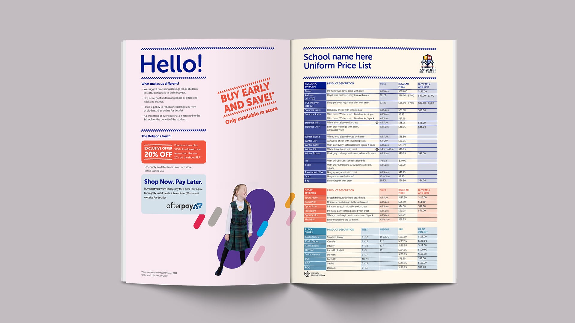
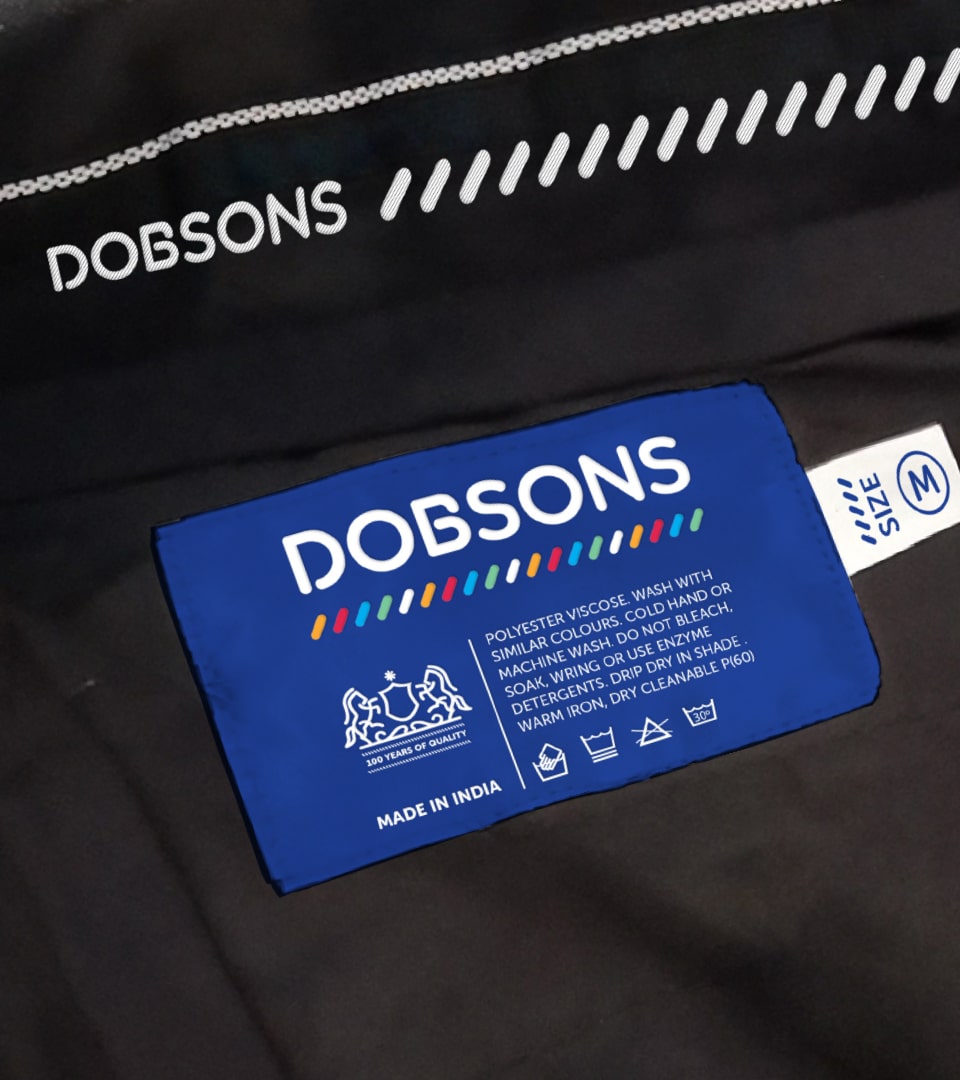
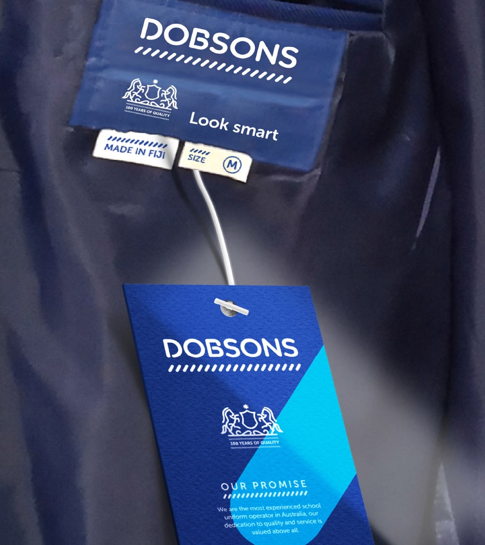
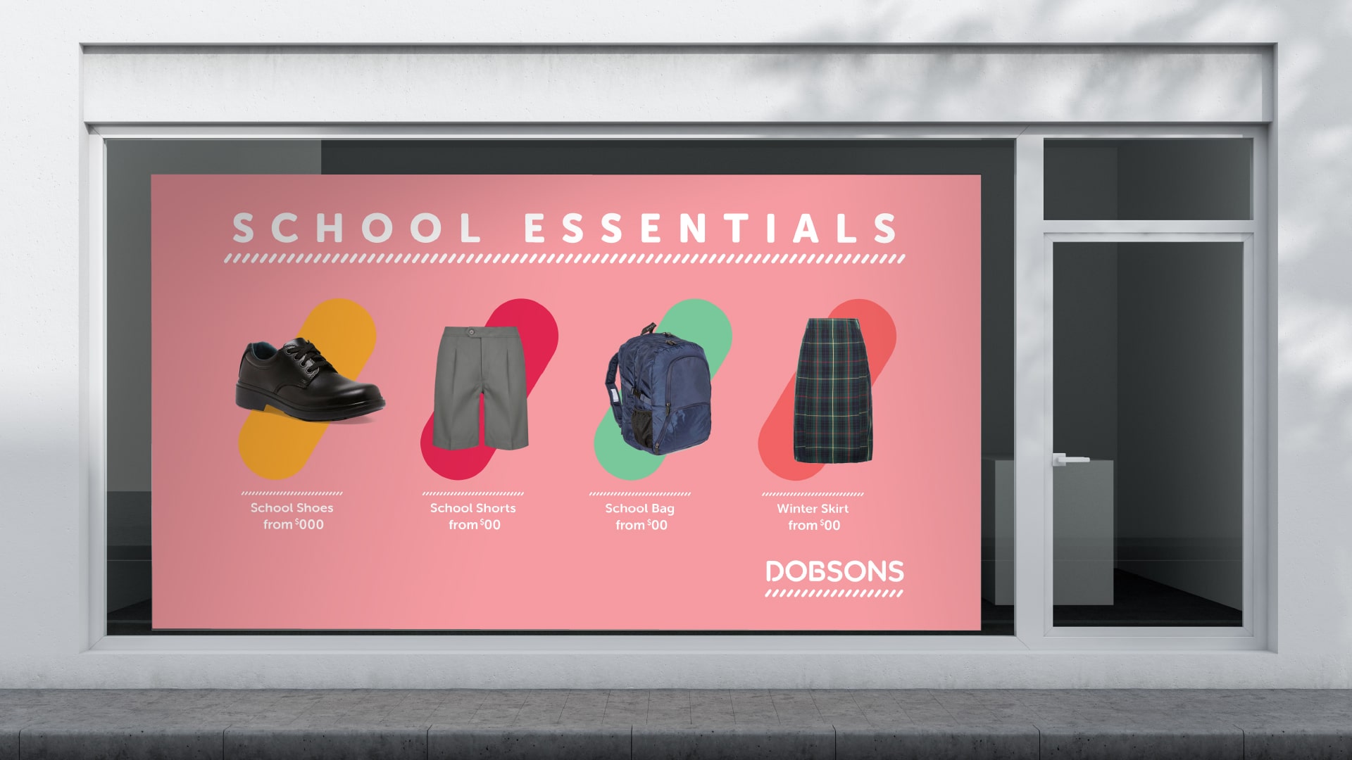
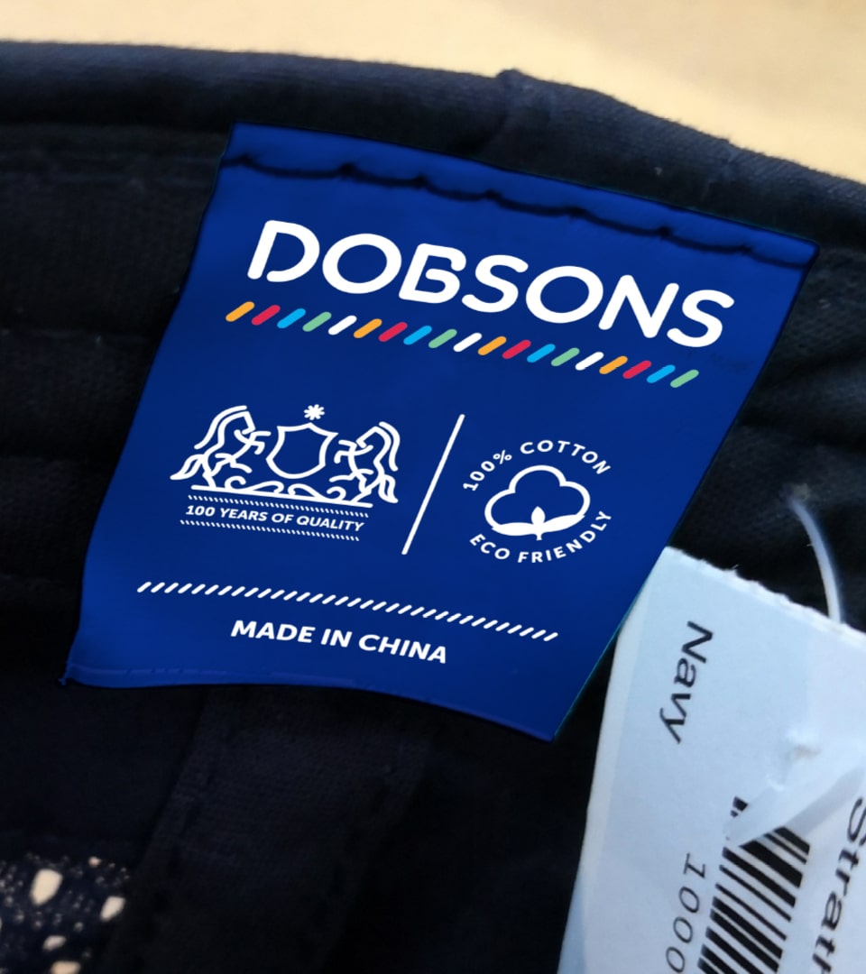
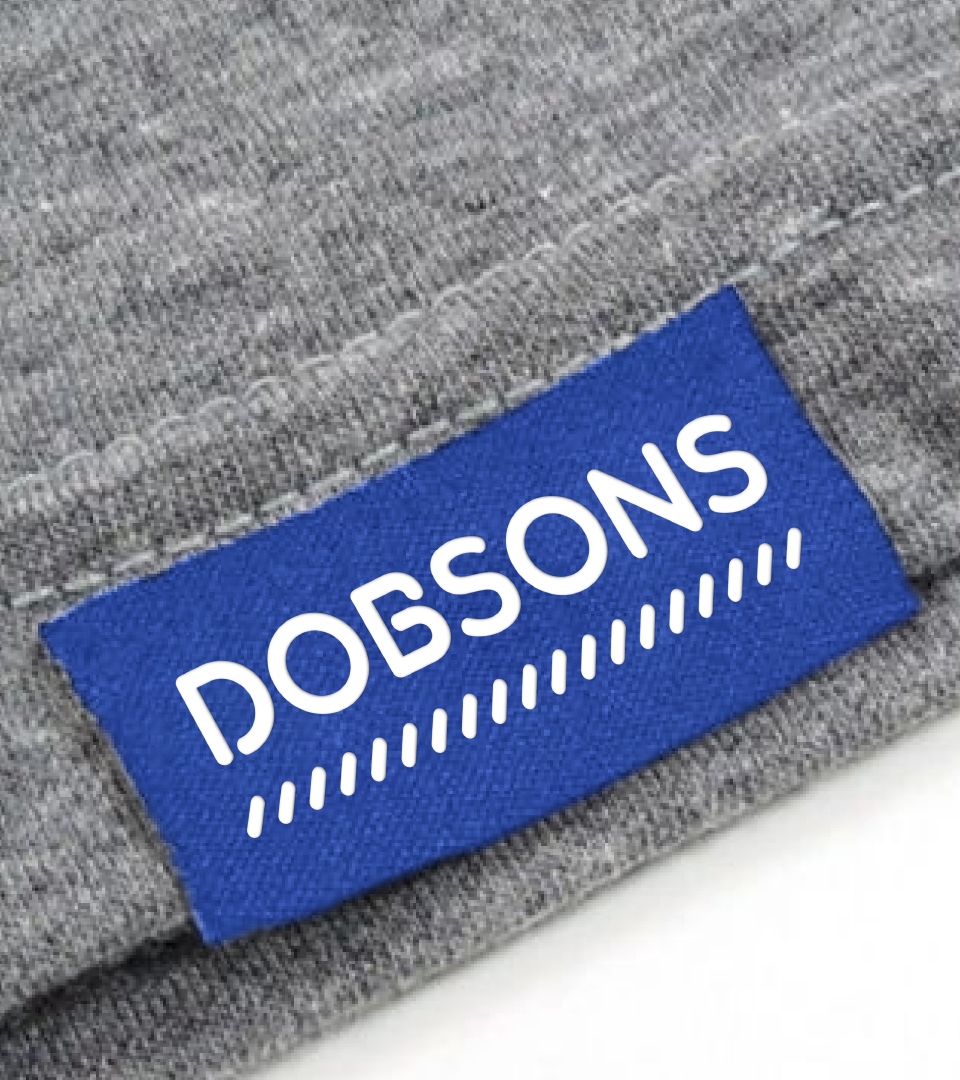
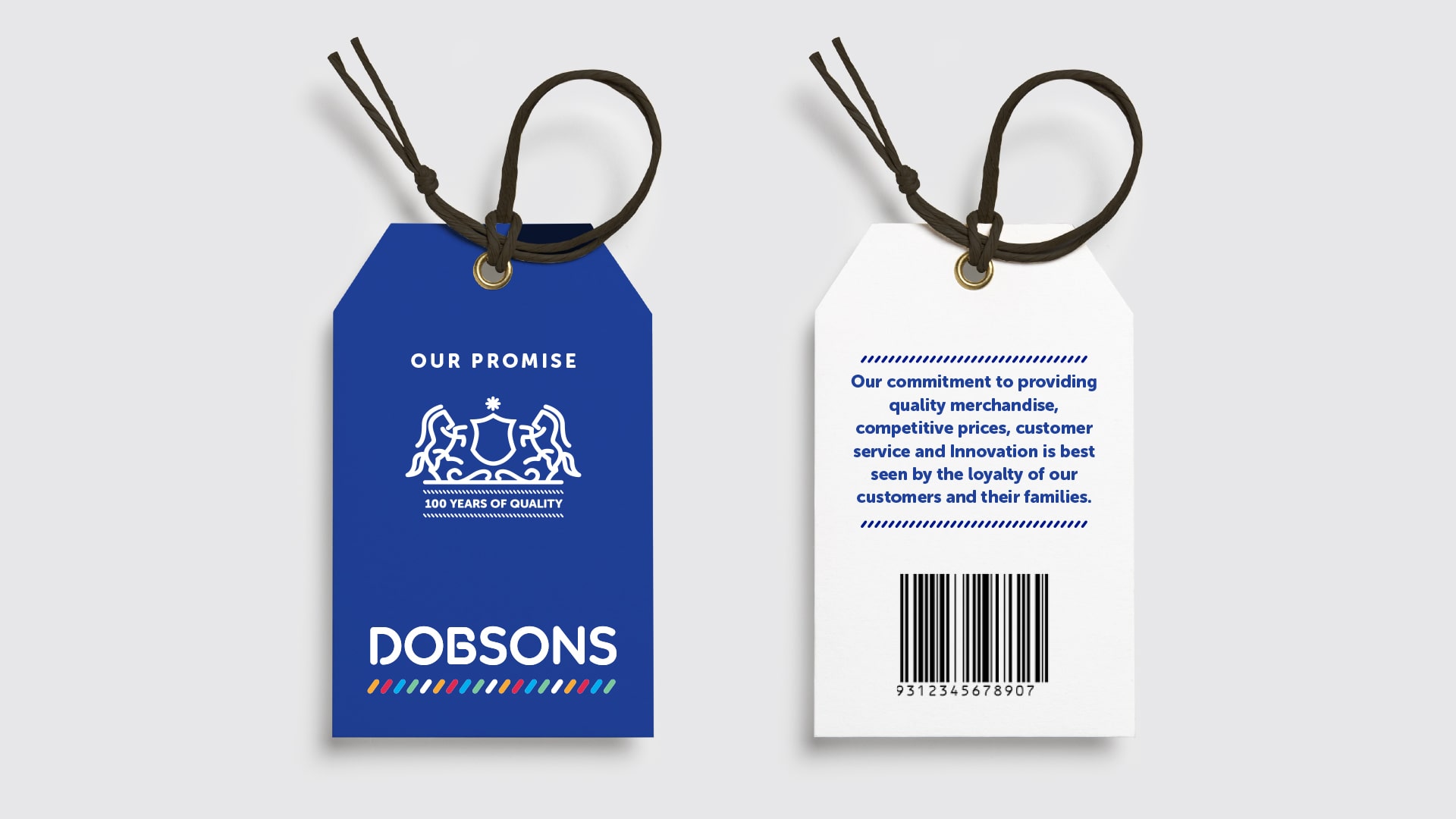
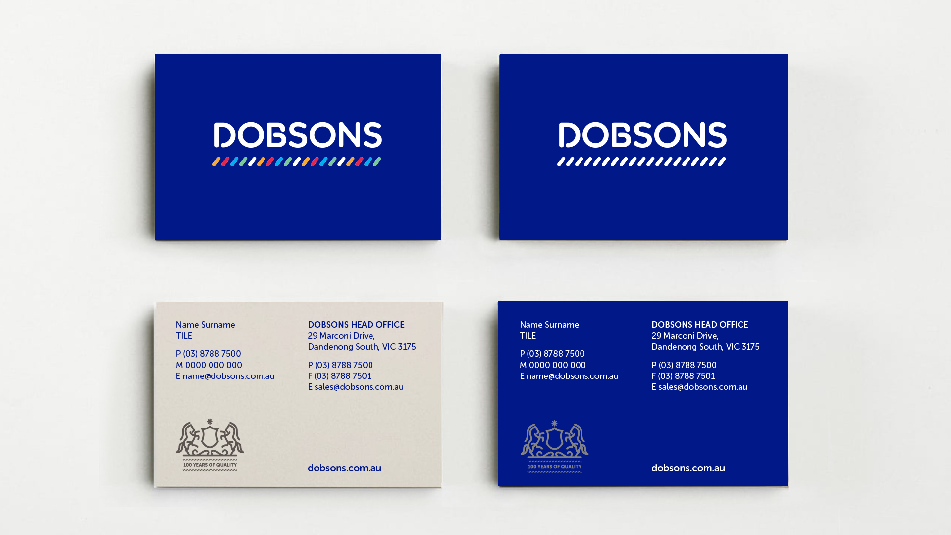
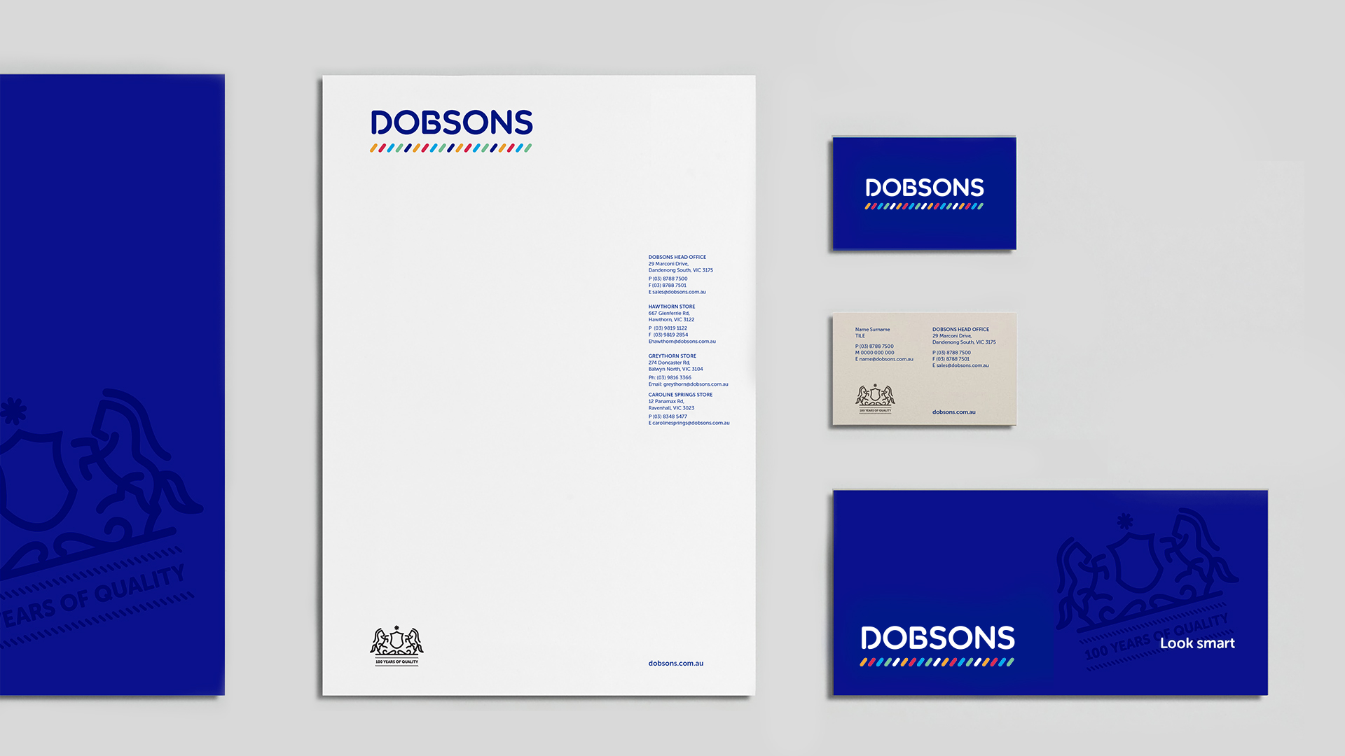
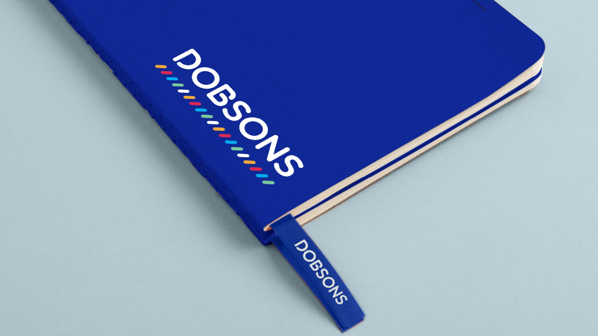
Based on this positioning thought, Traffic created a brand mark that was friendly and approachable, with a sense of fun, whilst retaining the family history. The incorporation of the braid device in the brand mark, a signature piece in the uniforms of school captains and prefects, represents leadership and sets Dobsons apart from their competitors.
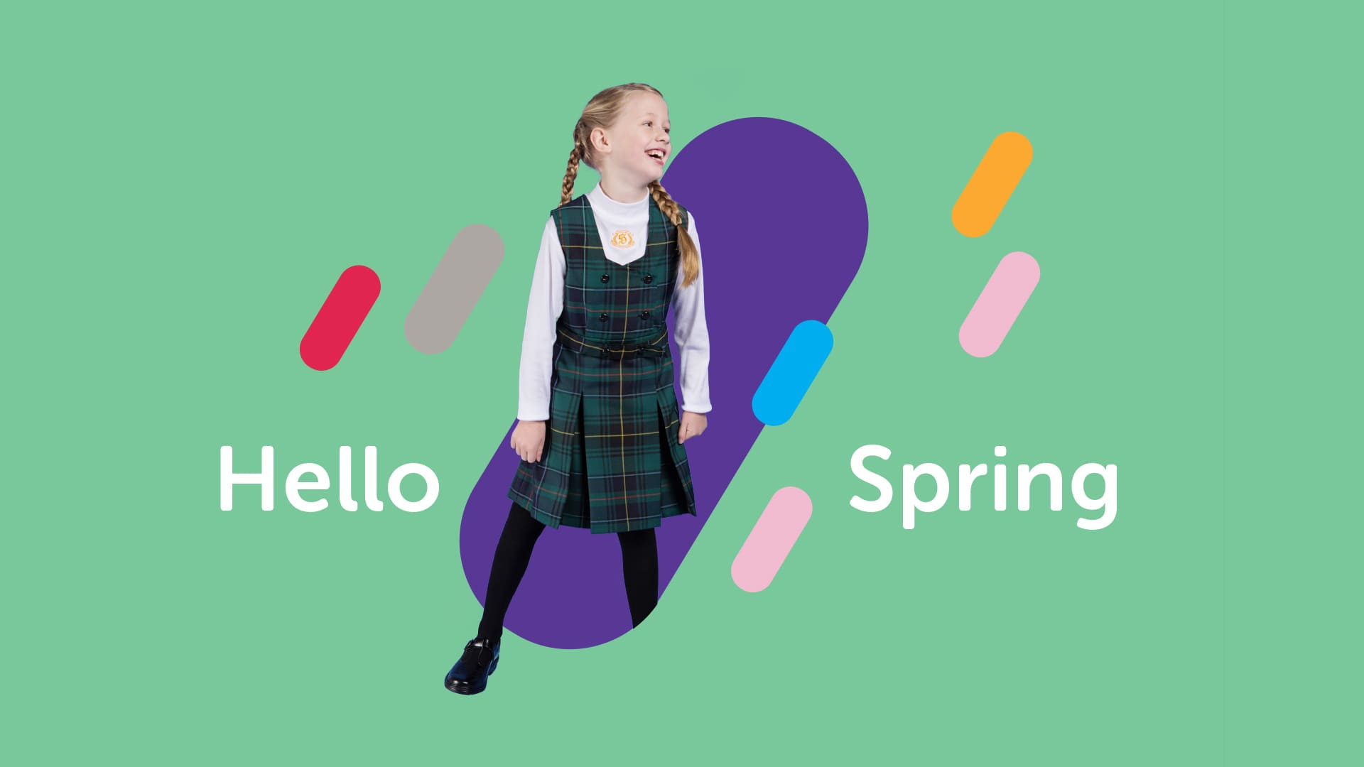
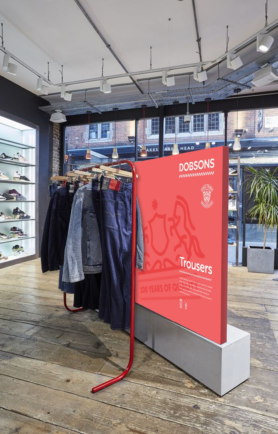
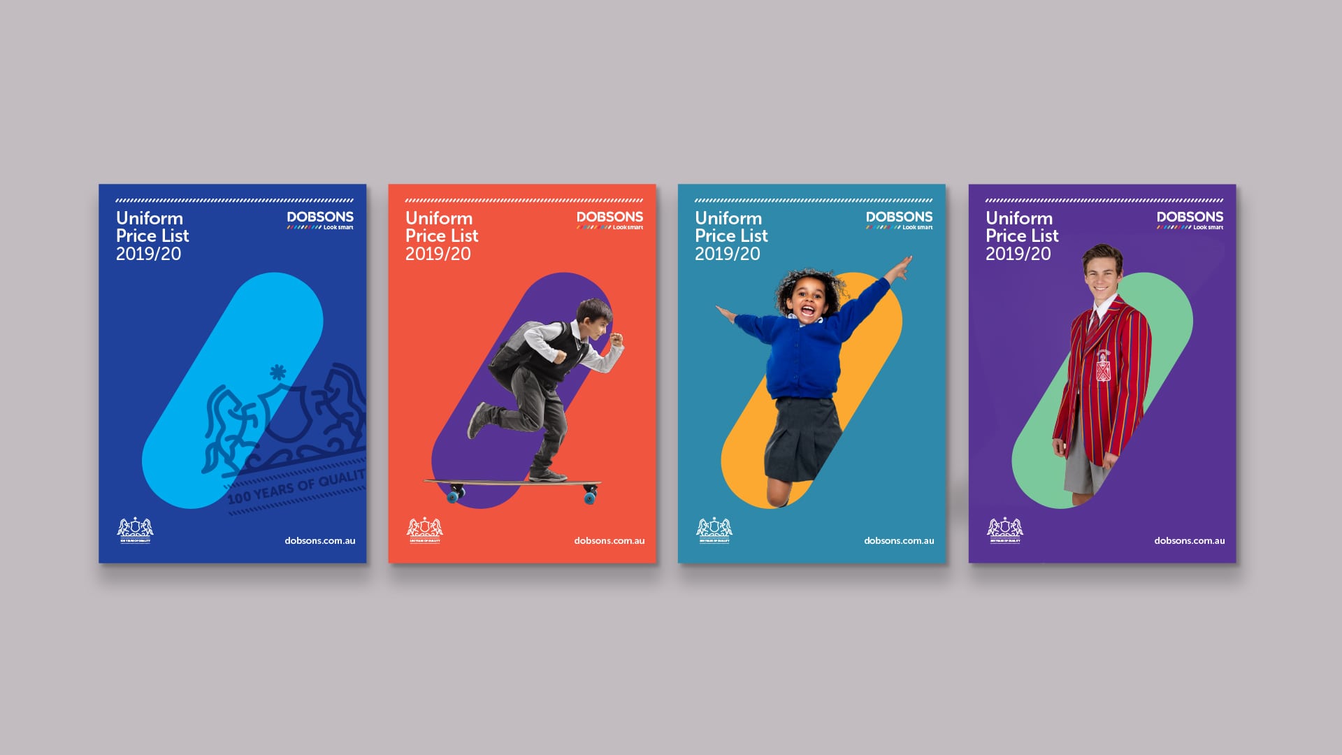
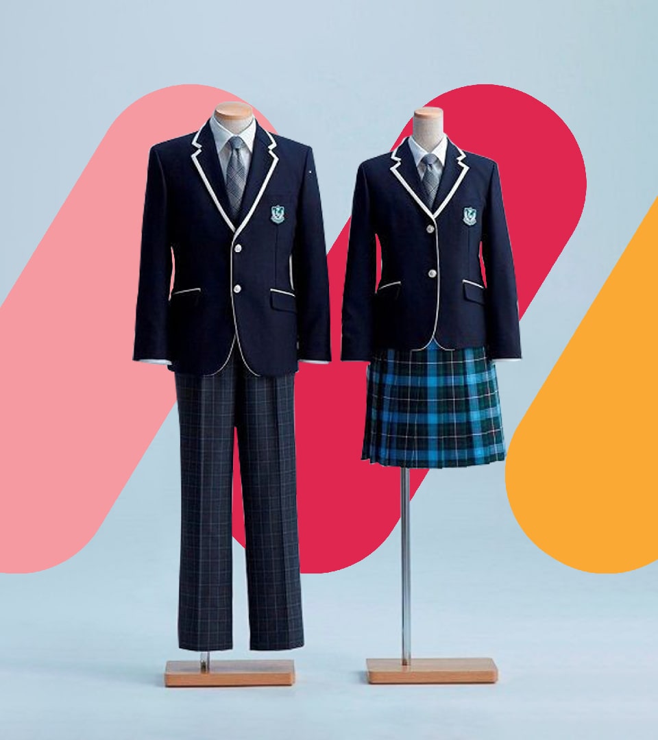
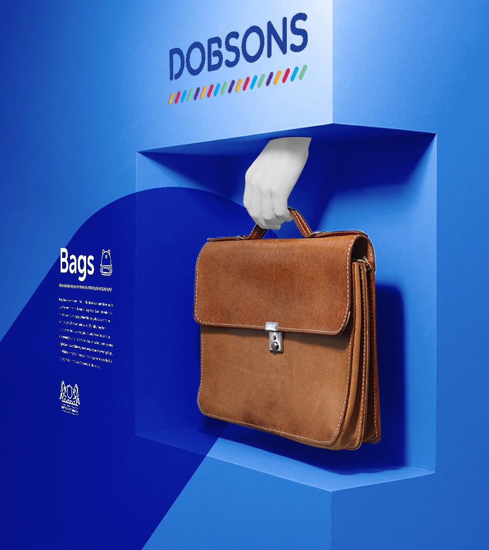
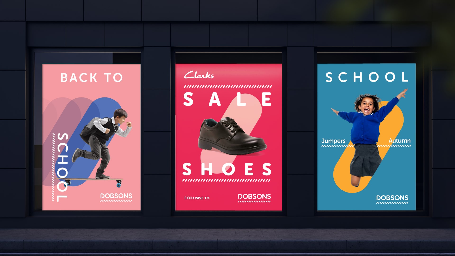
The visual identity developed allowed the brand to present itself in a way that showcased the product and students in a non-traditional context. This spirit tapped into an emotional connection for our audience to feel a sense of freedom and focus on being their best selves.
The colour palette created a sense of joy – expanding into a more creative territory that allowed flexibility could be tailored to suit the audience.