Mah Sing
Reimagining a Malaysian Property Developer
Background
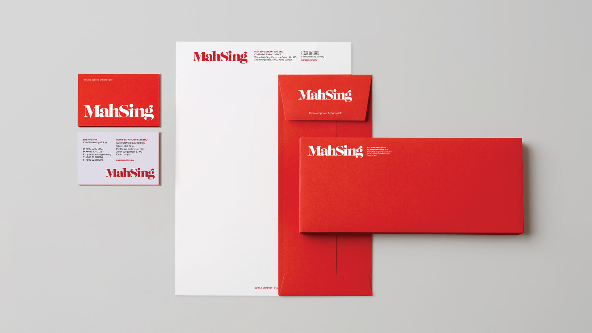
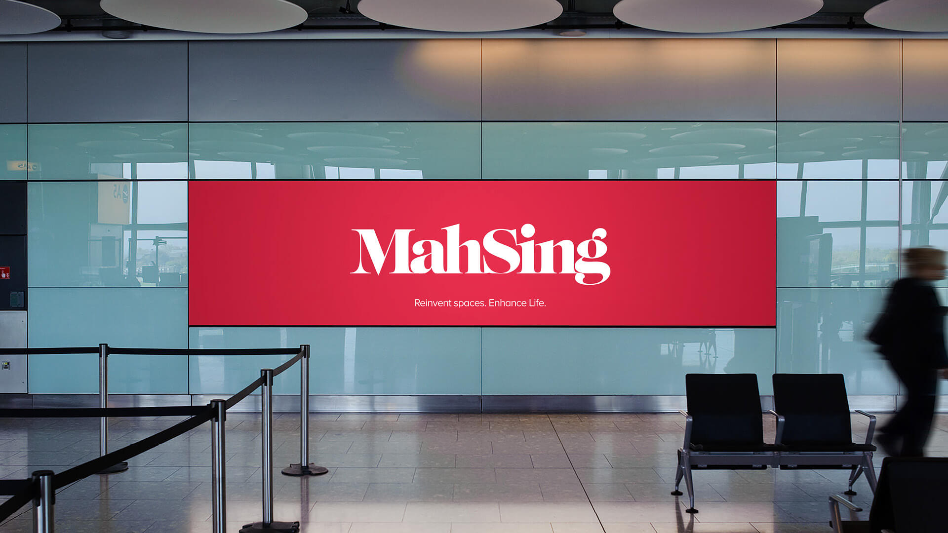
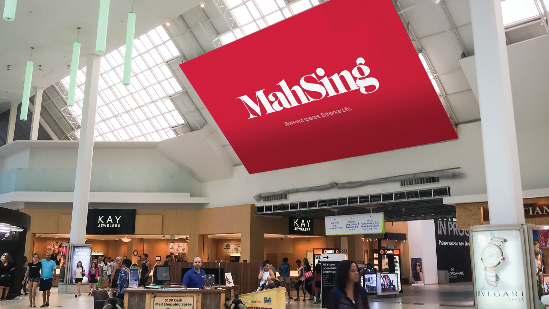
Mah Sing is one of Malaysia’s foremost property developers with a proven record of over 50 years of award-winning, successful residential and commercial projects right throughout the country. Their brand was in need of a refresh to make it feel more contemporary and future-focused.
Strategy
After an extensive review which included a brand audit, stakeholder interviews, a workshop, a review of existing comms, research and business plans, we determined that as a business, we Mah Sing needed to shift to become customer focused, proactive, and outward looking. A trusted companion who is approachable. Dynamic. Courageous. Cutting-edge. Charismatic. Visionary.
Solution
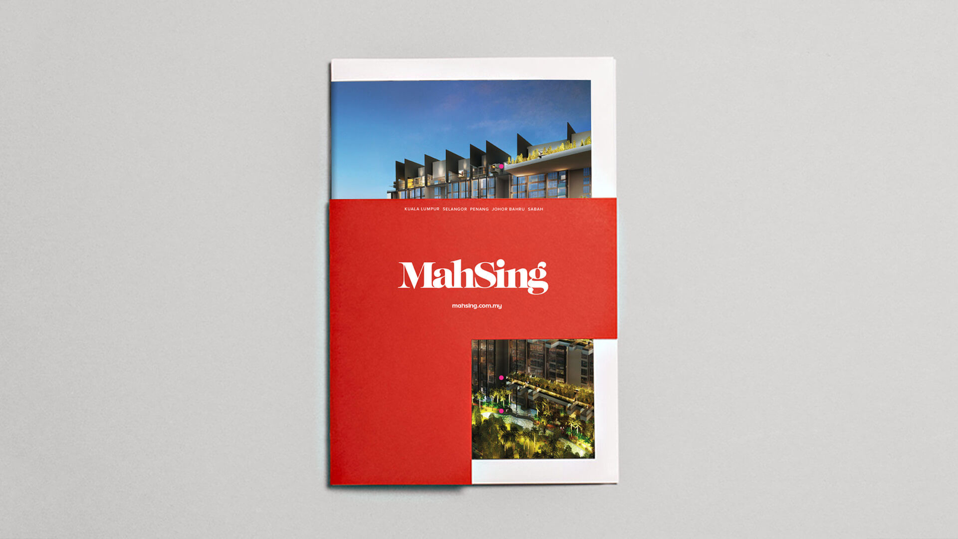
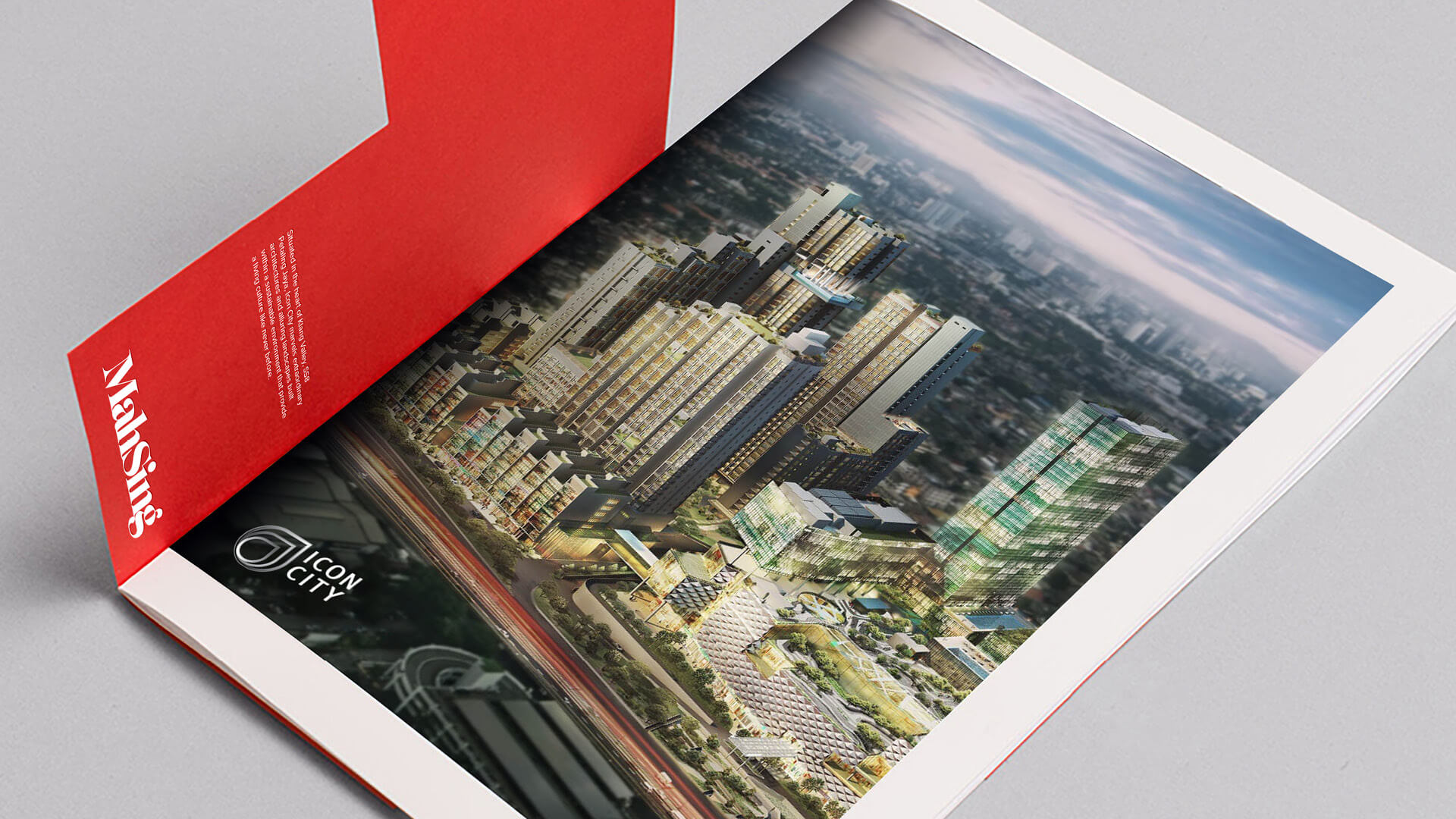
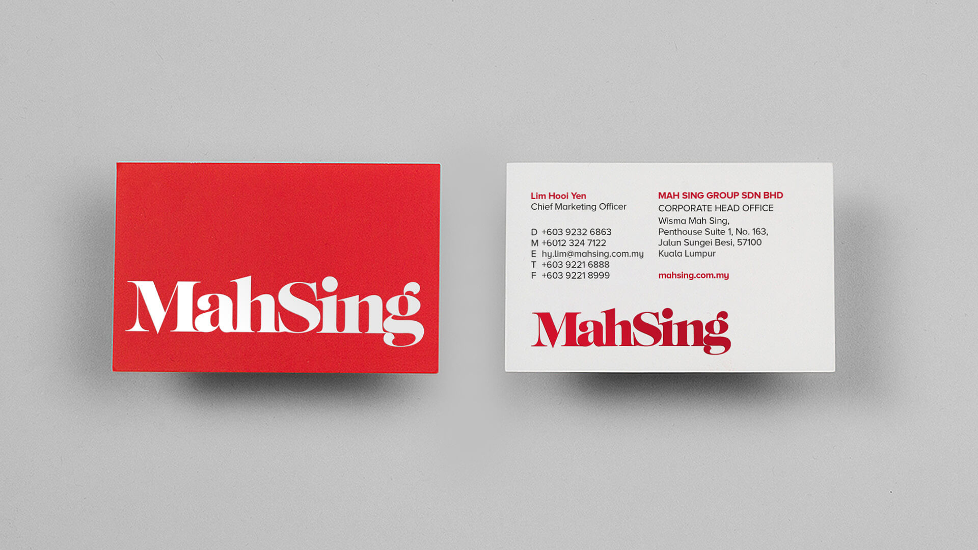
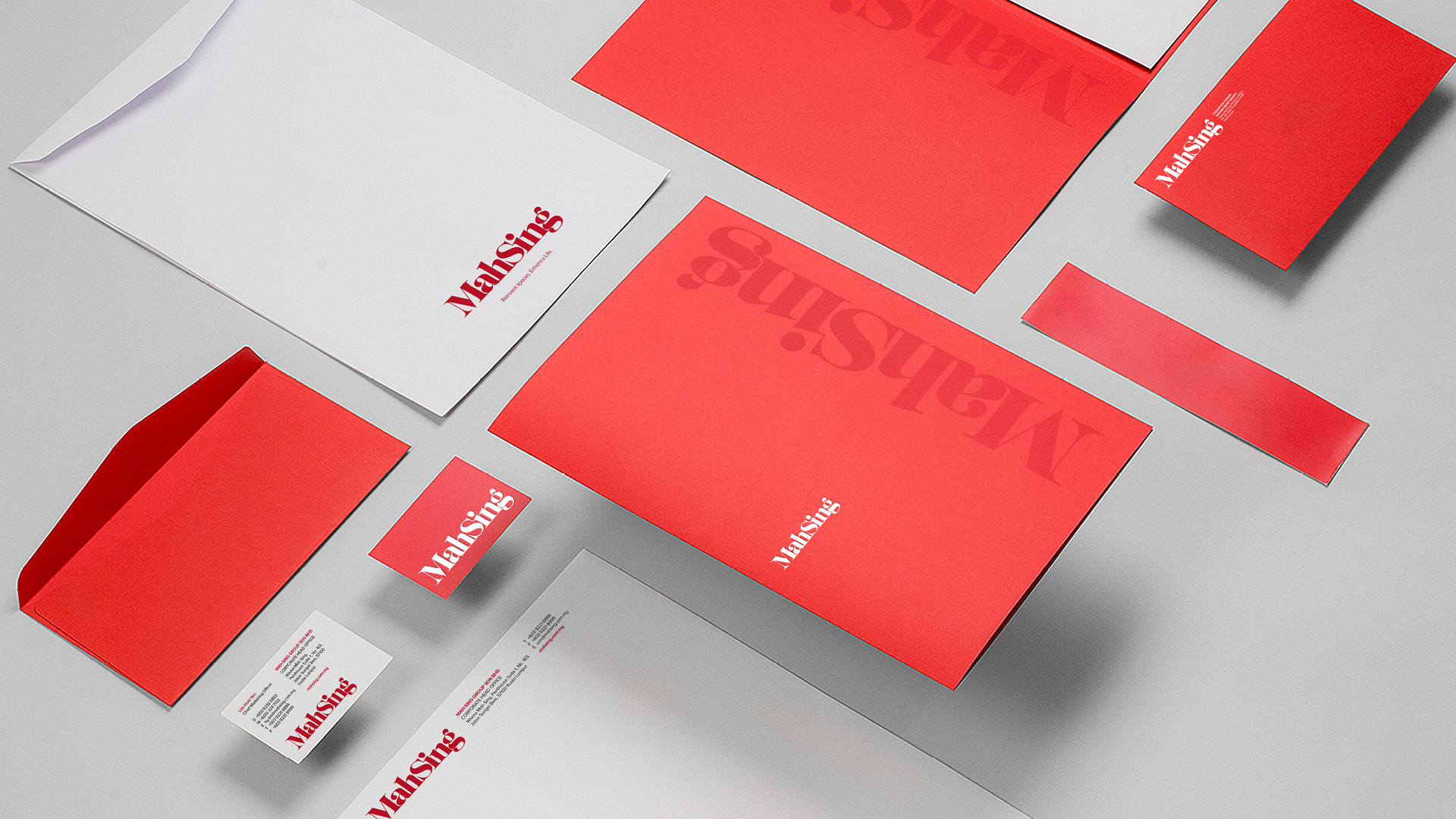
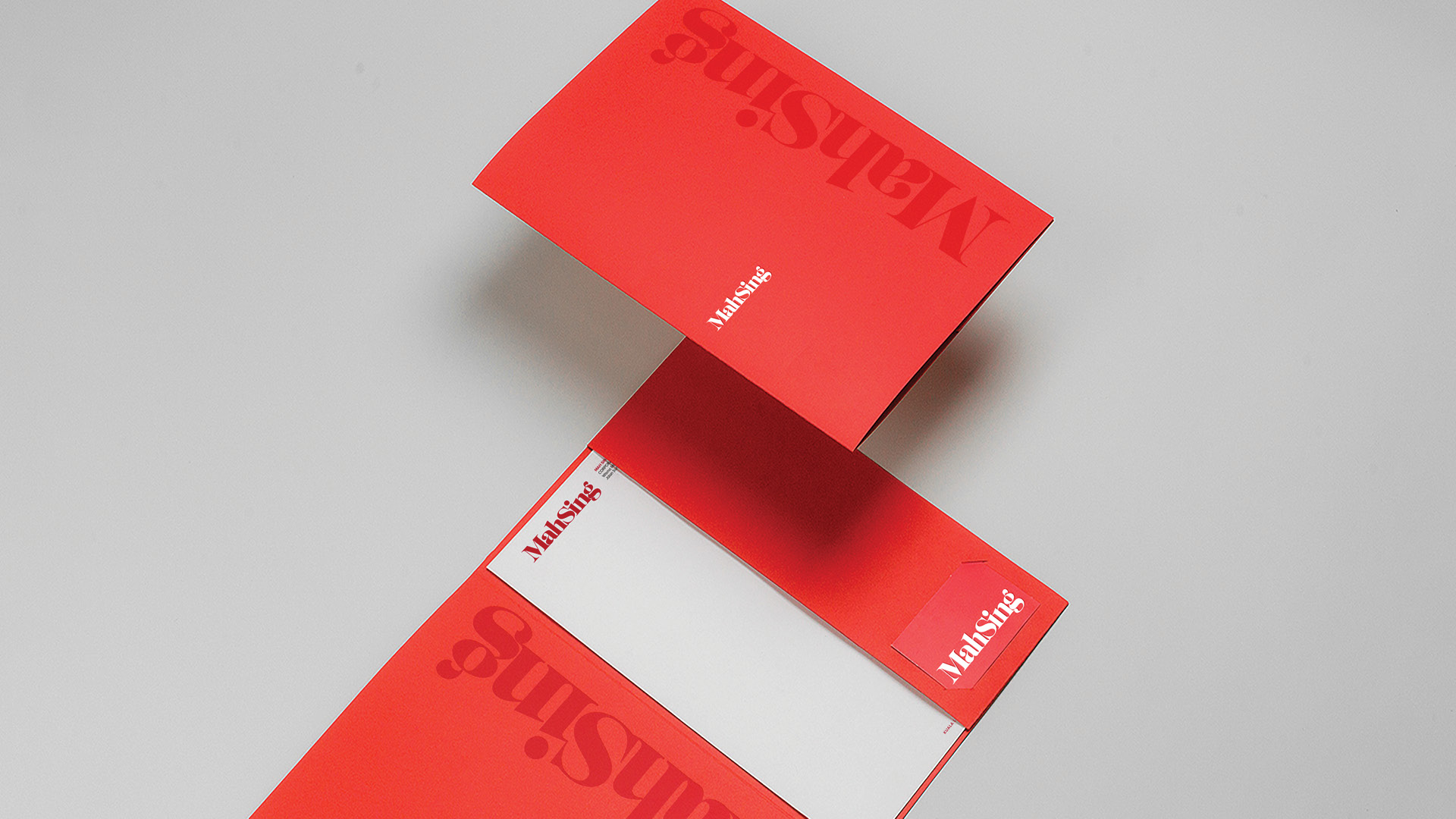
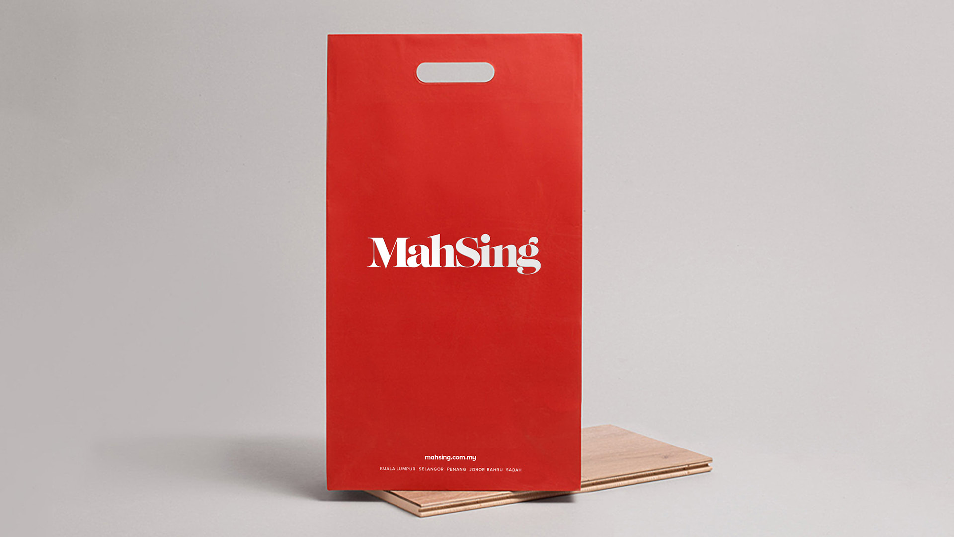
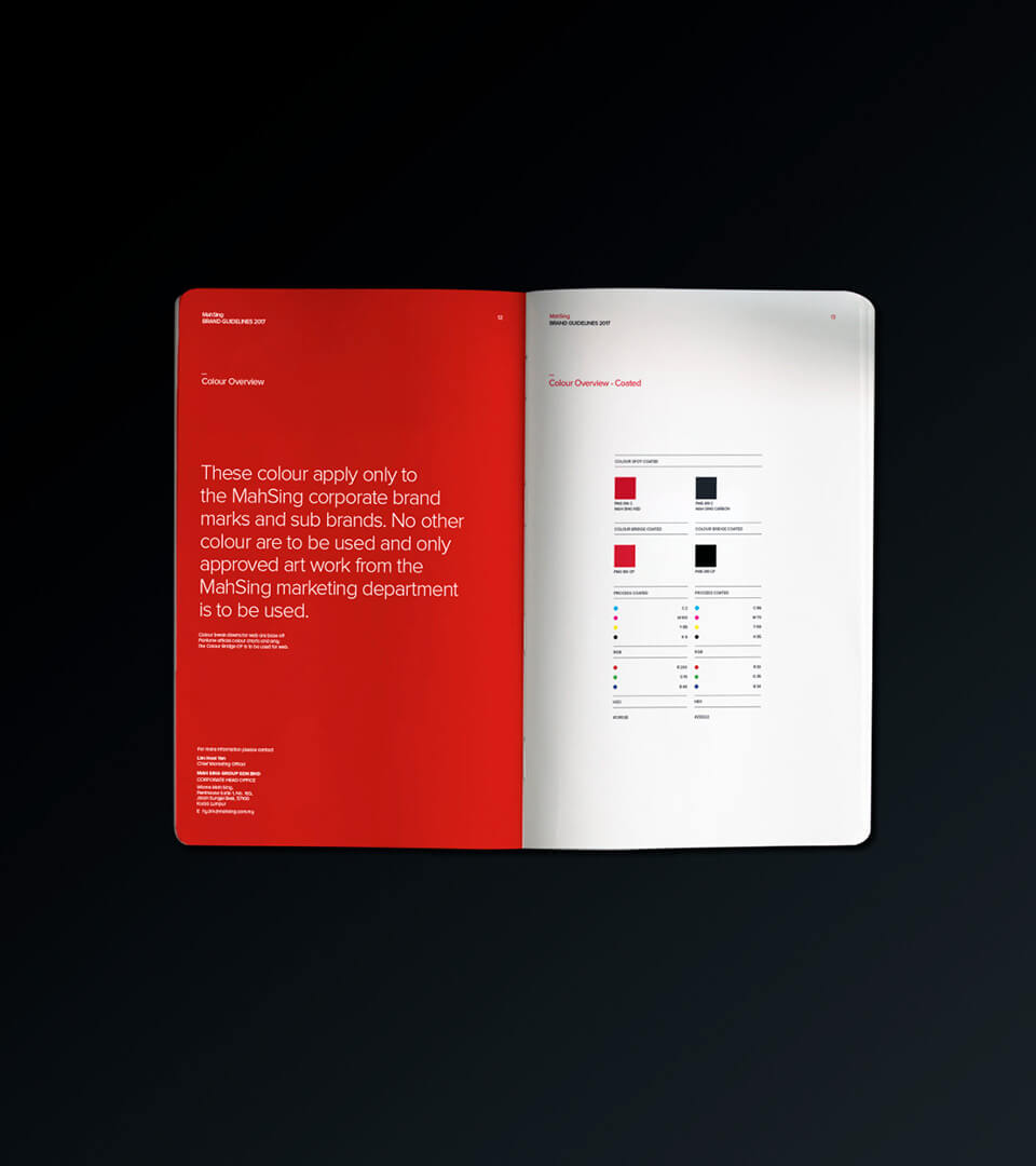
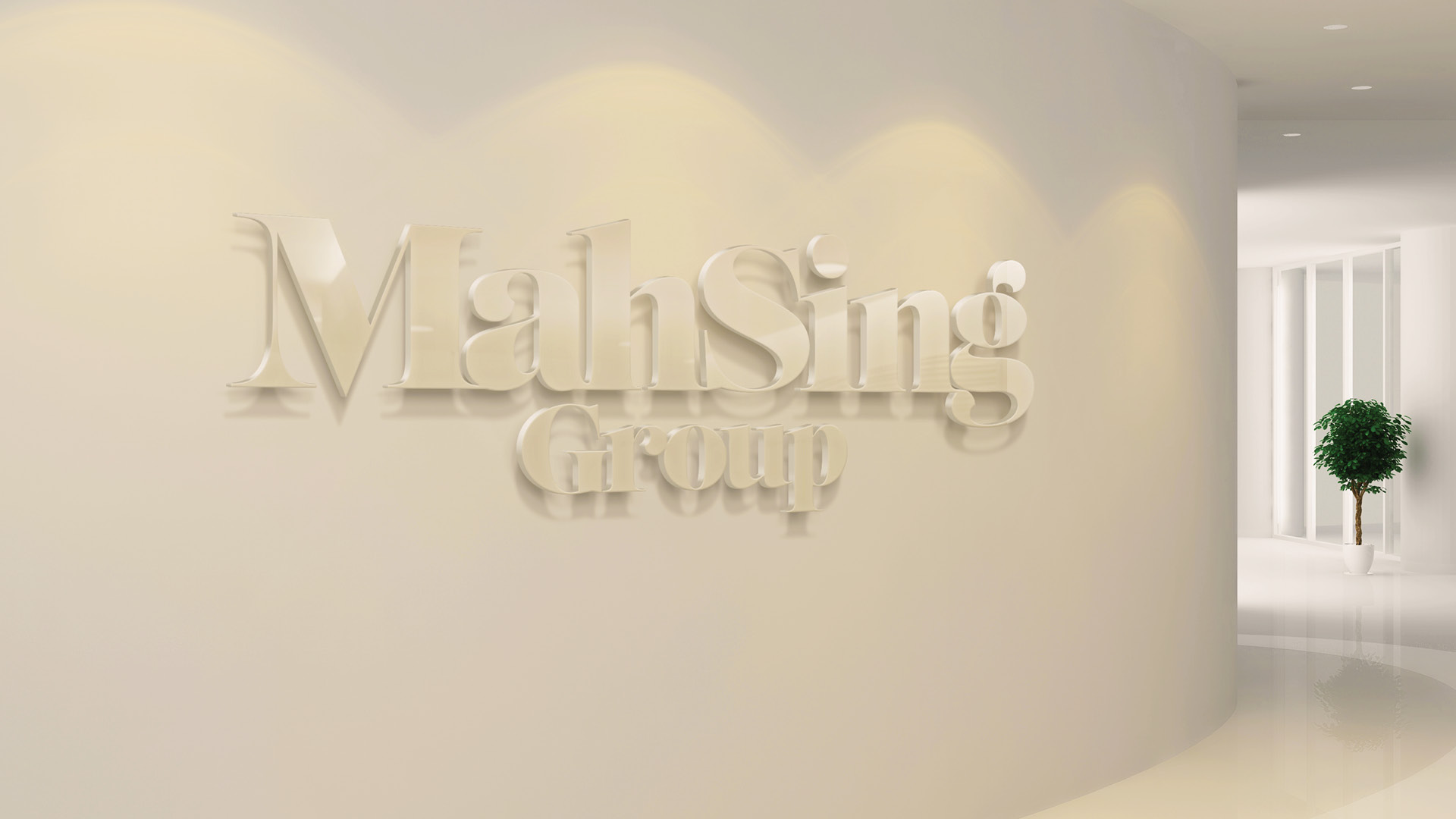
We decided to retain the vibrant red colour from the history of the brand is a connection to the past, with red representing luck, courage, passion and happiness. From a design perspective, the new specifically designed logotype presents a corporate face, but with a hint of playfulness to ensure that Mah Sing feels like an ‘approachable’ company but also a visionary one, and one that is never standing still. Mah Sing are always on the move, excited by challenges and possibilities, always going the extra mile for their customers.